The Sanctuary Palette
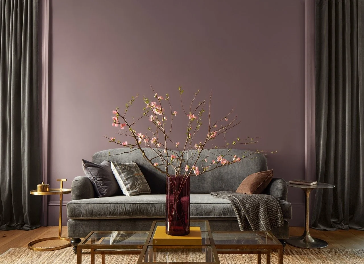
It's that time of year again when the trend forecasts for 2025 start popping up, and I’ve been noticing the buzz around Benjamin Moore’s Color of the Year, Cinnamon Slate 2113-40, all over my social media. It’s quite a romantic color—soft, muted, and perfect for fall. I can imagine it in a cozy room, where you curl up and relax while watching the leaves outside turn from yellow to red and brown. Sherwin Williams is also predicting a moodier palette for 2025, with colors like SW 9605 Clove, SW 6089 Grounded, SW 9110 Malabar, and SW 6282 Mauve Finery—all of which carry that same inviting, warm vibe. They’ve also thrown in some bold choices, like a pop of chartreuse, which is pretty adventurous!
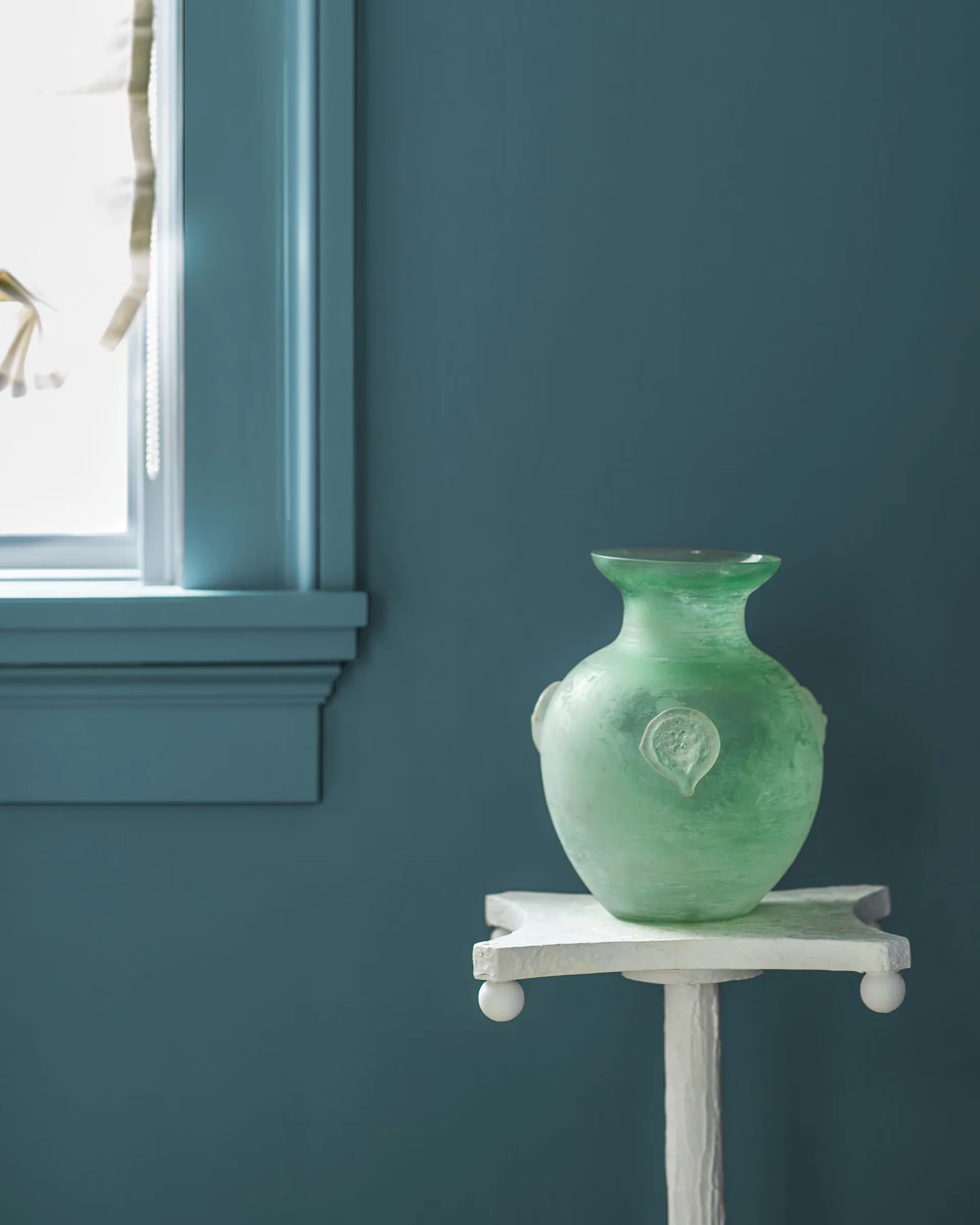
My personal favorite so far is Sherwin Williams’ SW 9639 Rain Cloud—a dark, moody blue-gray that reminds me of those afternoon thunderstorms we often get here in Naples. I love those storms, and the color feels so calming and atmospheric. Benjamin Moore also included some similar hues in their secondary color palette predictions, with colors like Stained Glass CSP-685, and Rosepine 461.
But no matter which side of the color spectrum you lean toward, one thing is clear: people are craving originality in their spaces again.
And I think it’s long overdue. For a while, design has leaned heavily into gray and white, creating spaces that felt simple and clean, but over time, has left many of us craving more warmth and intimacy. I think we’re ready to embrace sanctuary spaces that feel more vibrant and alive.
Now, with colors like chartreuse and mauve showing up, I’m trying to recover from my 1980’s color palette PTSD and have an open mind. But I do enjoy seeing the trending trim and millwork details, color drenched walls, ceilings and moldings, vintage furniture, and custom tailoring. I’m starting to see some lushness return to design. You know this speaks to my maximalist heart.
As one of my core sanctuary design philosophies is crafting spaces that connect us to the beauty of the natural world, the truth is that I don’t really follow trends. Timeless design is more my thing and that natural connection is my love language.
For me, sanctuary design is about pulling in the colors of the environment around us.
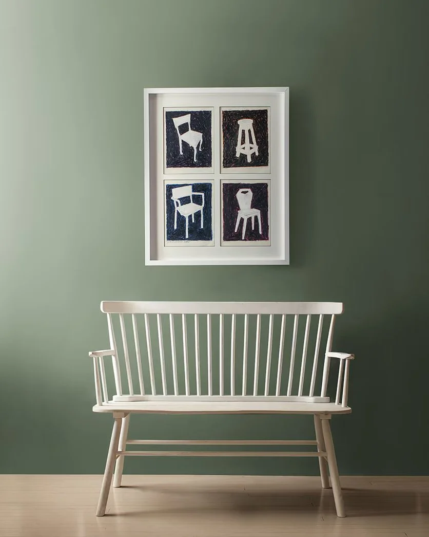
In Florida, that means the vast blue skies, the countless shades of teal and aqua in the ocean, the browns and tans of trees and sand, and the many greens of our vibrant landscapes. But no matter where in the world I find myself designing a space of sanctuary, I love seeing shades that reflect the natural beauty around us—the forest greens of the North Carolina mountains, the deep blues of the Pacific Ocean, the warm, creamy tans of desert dunes. These are the palettes that mother nature has gifted us, and they’re the same ones I love to bring into our environments. They blur the line between inside and outside and help us reconnect with the healing power of the natural world, which is what my work is really all about.
Ah, sweet sanctuary!
So, I’d love to hear your thoughts! Are you drawn to this spiced, fall-inspired palette that’s making its way into the design world? What do you love about it? And if it's not your vibe, I’m curious—what colors do you see shaping your sanctuary in 2025?
With love and gratitude,
Lisa


